Smartabase’s dashboard builder has some useful new features, which we’re pleased to let you know about.
If you haven’t tried the dashboard builder yet, check out our helpful guide. We’ll show you how to set up dashboards, use dashboard components and understand the data being displayed within your dashboards.
Expect the 2.21 update to become available to you shortly.
Set a past or future date as the default for a date picker
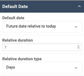
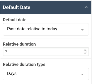
You can set the default date of the date picker widget to a date in the past or future, relative to the viewer’s current date. For example, when charts and tables in your dashboard are filtered by date picker widgets, you have them automatically display data from the past week. Because these are defaults, the viewer can still choose other dates.
More customisation options for chart widgets
In the categorical chart widget you can hide categories that display null values in a set of data. Hiding null categories can make charts easier to interpret. This is particularly useful if there are many categories along the x-axis of the chart.
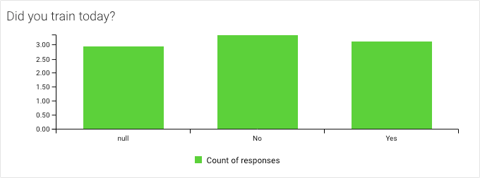
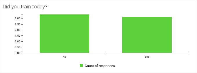
You can also set data labels for individual data series in a time series and categorical chart. Previously, if you wanted to show data labels in a chart, they would appear for every data series in the chart. Now you can choose which series should have labels.
For example, you can show data labels for an athlete’s training load score in a time series chart like the one below. In this chart we set an upper and lower training load threshold, but chose not to display the labels for these series.

In addition to this, there’s a new line style for time series and categorical charts. You can now use a dashed line style to represent data series. In the example above, we used a dashed line to show the upper and lower thresholds.
Visualise static data in radar charts
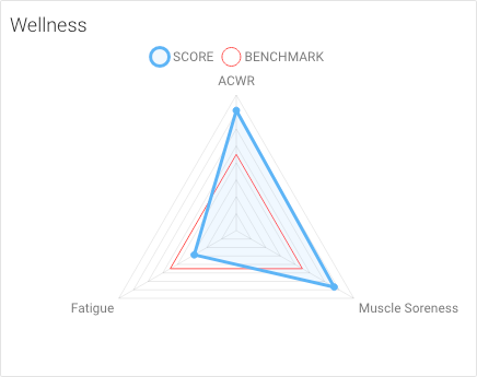
You can now set a radar chart data series to be a static value. A static value can serve as a benchmark or threshold for other series in the radar chart.
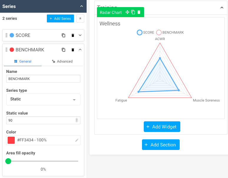
For example, you could compare the fatigue, soreness and workload levels of an athlete against a set benchmark value in the radar chart. This makes it easy to visualise differences between an athlete’s data and your benchmark.
General improvements and bug fixes
- When you change the data type for a tile widget, the conditional formatting will reset correctly.
- The first section of a newly created dashboard will collapse by default.
- Radar charts are now displayed properly in sections which are set to collapse by default.
- We’ve optimised the background colouring for axis tick marks in the radar charts widget.
- When you add a new section, it’s automatically selected for further editing. Previously, the canvas was selected instead.
- You can use the escape key (Esc) to close pop-up boxes when you view a dashboard.
- You can use Ctrl + P (Windows) or ⌘ + P (MacOS) to open the print settings for a dashboard.
Feel free to contact your lead builder if you have any questions about building dashboards, or you can visit the dashboard builder guide.
Highlights from your last dashboard builder newsletter
In your last newsletter we announced:
- The ability to print all canvases in your dashboard at once.
If you missed it, you can read the last dashboard builder update here.