Smartabase’s dashboard builder has fantastic new features that we’re excited to share with you.
If you haven’t tried the dashboard builder yet, check out our helpful guide. We’ll show you how to set up dashboards, use dashboard components and understand the data being displayed within your dashboards.
We hope you get plenty of use from version 2.25 of the dashboard builder!
A new widget for aggregating data in tabular format

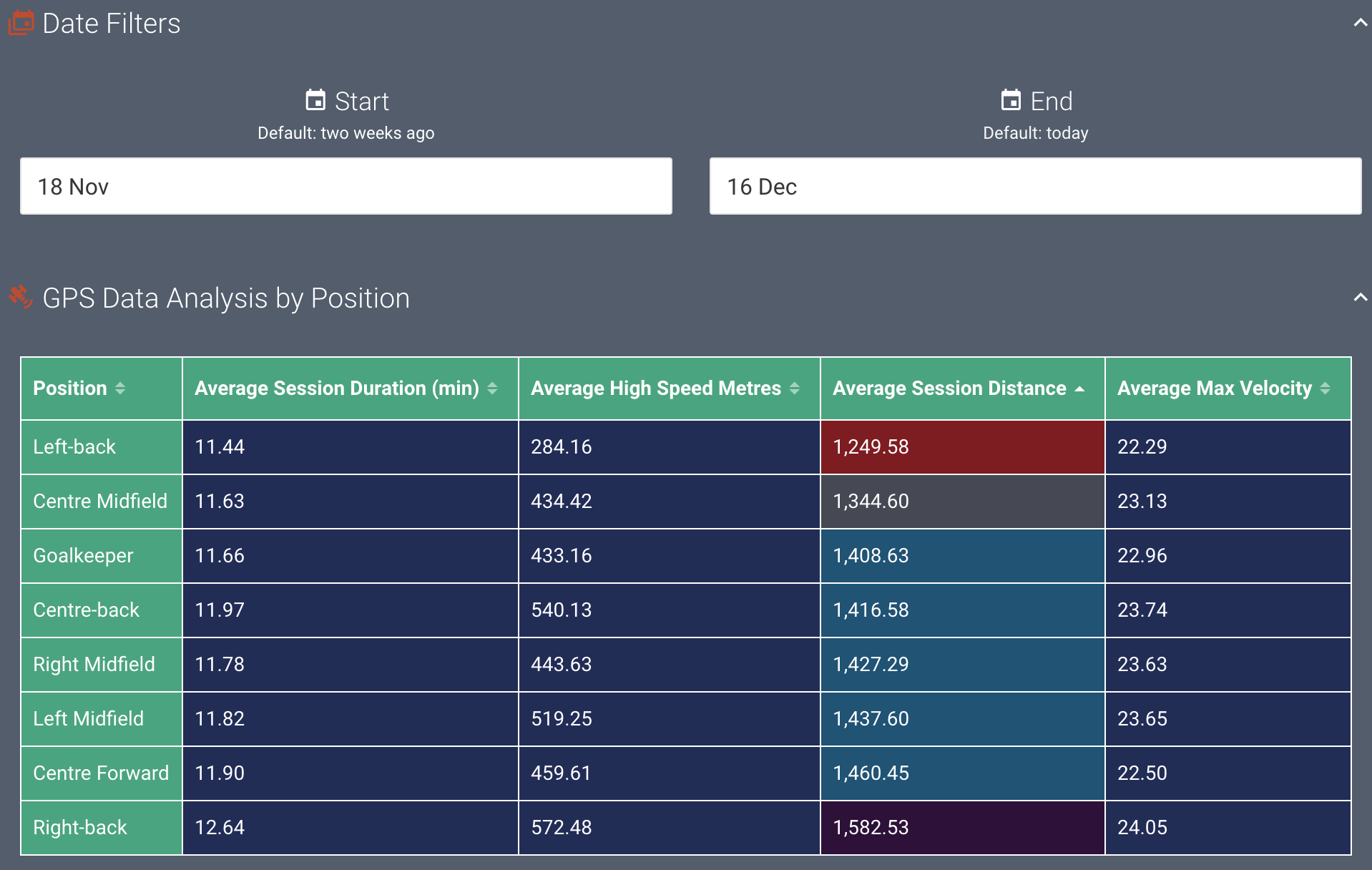
The freshly-developed aggregation table widget gives you the ability to choose how you want to generate rows. You can add as many columns as you need and filter each of them independently. Then, aggregate the data in each of your columns on a row-by-row basis.
The example here uses a GPS event form to report session information for each position in the dataset. We’ve added columns for each metric we’re interested in and averaged them by position (note that it’s easy to use other aggregations instead of a mean). Each column can use separate filters, aggregation types and conditional formatting rulesets.
Visit the new help article for the aggregation table widget to find more information on how to use this widget.
More ways to customise your pie and donut charts
You can fine tune how categories work in pie and donut charts using new properties that we’ve added for this version of the dashboard builder.
It’s now possible to set the data type, choose a display format, whether null categories should be shown, or add custom prefixes and suffixes to categories. You can also choose how categories should be ordered and coloured in your pie and donut charts.
If you want to show percentages or values for pie or donut chart segments and tooltips, you can do this now as well.

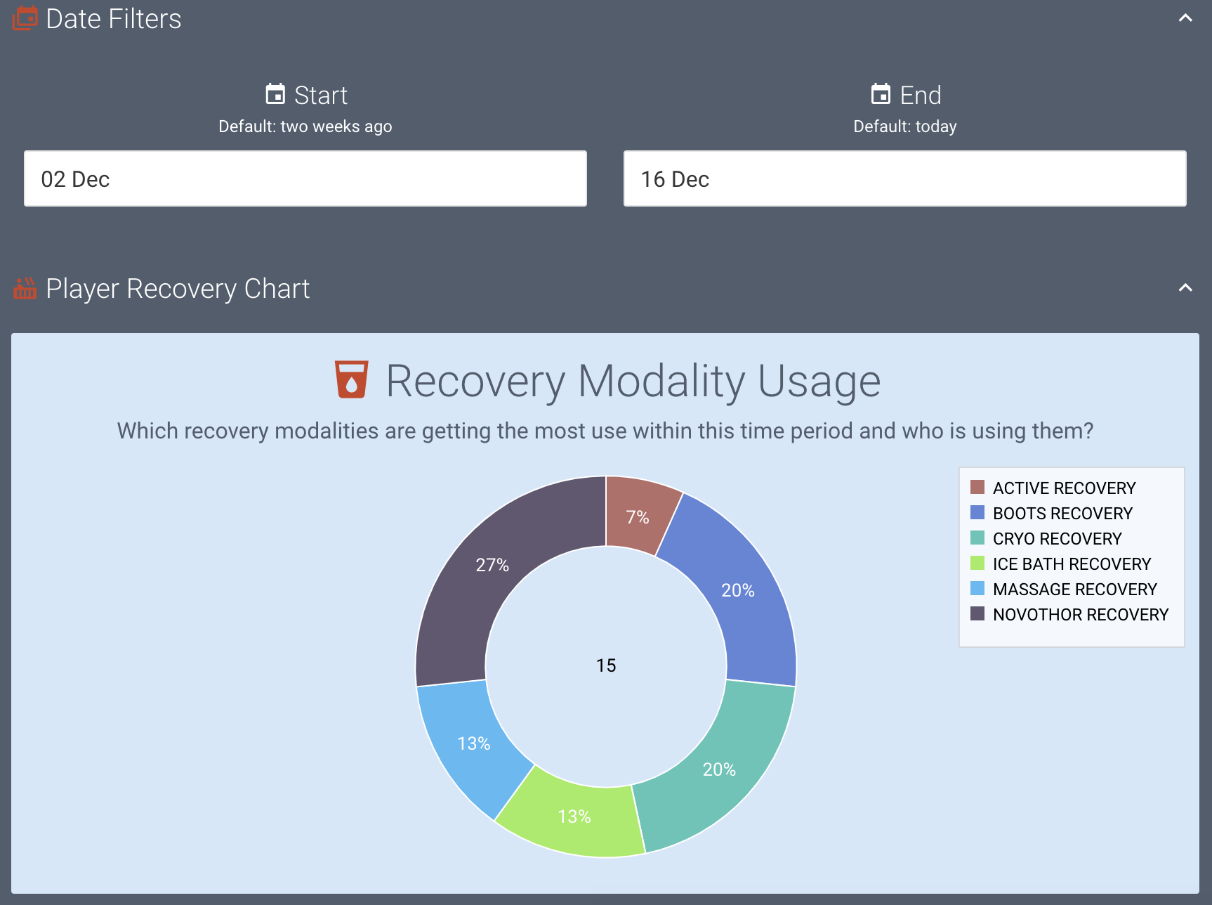
The example donut chart here shows a few of these new features in action. We’ve added custom categories, which means we can specify the category order and colour. This chart also shows the segment values as percentages.
In our example, we’ve based a canvas around a simple event form that has one multiple selection field which asks players to record the recovery modalities they’ve made use of in each recovery session.
The chart lets us easily visualise how often each recovery modality has been utilised within a specified time period. Using this information, we can better understand our players’ preferences for recovery and the utilisation of team resources (like equipment and therapists). We can also easily keep track of equipment, maintain accountability and make more informed purchasing decisions.
For more details about what you can do with the pie and donut chart widget, read the full help article.
Support for multi-select data
Smartabase has some field types that allow people to choose more than one answer. There’s a multiple selection field where people can tick more than one box from a set of options, and there are several sorts of body diagram fields. Depending on the type of body diagram, it’s possible to choose multiple body areas, injuries or illnesses.
The dashboard builder now supports multi-select data for setting up categories when you use the pie or donut chart widget or the aggregation table widget. If you want to use a multi-select field type to create categories for one of these widgets, just choose the field type from the Multiple selection field type list in the Category properties.
If you’ve set up calculation fields that return multiple values, you can also make use of this data. Simply choose the Custom option from the Multiple selection field type list, then provide a delimiter and a list of characters to remove.
General improvements and bug fixes
- It’s now possible for you to choose a colour scheme for all avatars included in your dashboard. You can choose from full colour (default), grey, black, or white. Use the dashboard settings screen to update the avatar colour scheme.
- You can now customise the placeholder text for the table widget. This is shown when no data is able to be displayed.
- When a section contains a widget that isn’t set up correctly, you’ll see an error icon for that section as you’re editing your dashboard.
- We’ve updated the behaviour of the record card so that it only shows the About and Date fields once – either in the order you’ve added them to the record card or at the top, if you haven’t specified where they should appear.
- We’ve resolved an issue where the dashed line style sometimes would not work for series in time series and categorical charts.
Feel free to contact your lead sport scientist if you have any questions about building dashboards, or you can visit the dashboard builder guide for more information.
Bug fixes that were released between 2.24 and 2.25
- We fixed how record cards display when the dashboard is shorter than the record card.
- Likewise, we fixed the calendar display for the when the dashboard is shorter than the calendar.
Highlights from your last dashboard builder release notes
In the last release notes we announced:
- Zoom and sub-chart functionality for the time series and categorical chart widgets.
- More customisation capacity for the time series, categorical and XY scatter chart widgets.
If you missed them, you can read the last dashboard builder release notes.