We’re pleased to announce more great news – Smartabase’s dashboard builder has some exciting new features and continued improvements.
If you haven’t tried the dashboard builder yet, check out our helpful guide. We’ll show you how to set up dashboards, use dashboard components and understand the data being displayed within your dashboards.
We hope you enjoy using version 2.22 of the dashboard builder!
Use the matrix widget to visualise complex data
We’ve released a new matrix widget that’s designed for displaying large datasets in a flexible way. You can choose which fields should be displayed in the rows and columns of your matrix, then use the summary features to show useful information about each row or column.
This means, for example, you can show each event date as a column in a matrix or you could set the event dates as the row values in the first column. To help people view large matrices, you can also choose to freeze the first row and column in the matrix.
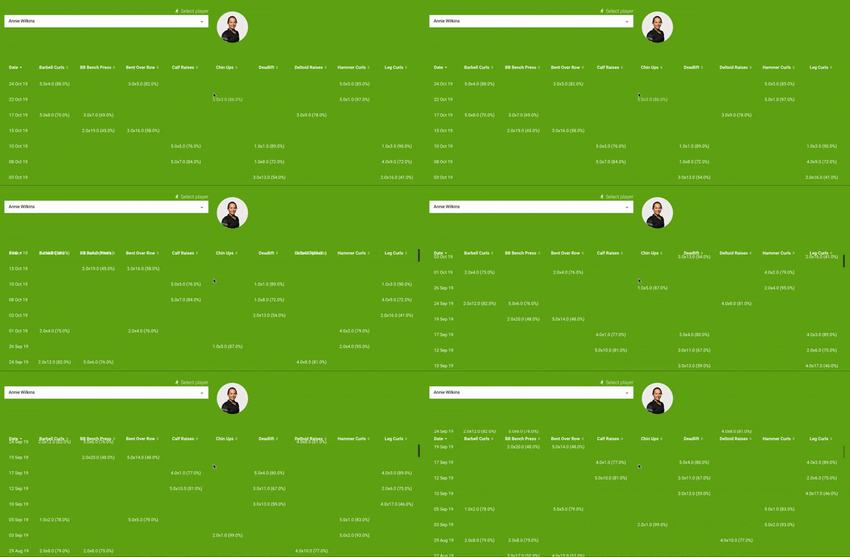
Like table widgets, you can filter the data shown in your matrix to include information about a single athlete, a selection of athletes, a specific date range or data from specific situations. Our example below shows recent workout program details for a selected athlete.

Display initials in avatars with no athlete image
When you include avatars in your dashboard (for example, in the table and matrix widgets), the dashboard builder will display the initials of any athletes who don’t have a profile picture. We’ve made this upgrade to help your dashboard readers more easily identify whose data they’re seeing.
![]()
General improvements and bug fixes
- When you change the data source for a tile widget, the record card fields will now reset correctly.
- We’ve resolved an issue where record cards would appear after selecting data points on a radar chart, even when disabled using the interaction properties.
- Date picker widgets now correctly display custom date ranges when you preview a dashboard.
- Adding gridlines on time series or categorical charts will no longer cause additional gridlines to appear.
- We’ve fixed an issue where deleted gridlines on time series and categorical charts would appear when viewing a dashboard.
- The x-axis tick labels now wrap correctly on categorical charts (if enabled).
Feel free to contact your lead builder if you have any questions about building dashboards, or you can visit the dashboard builder guide.
Highlights from your last dashboard builder newsletter
In your last newsletter we announced:
- The ability to set past or future dates as the default date in date picker widgets.
- More customisation options for the time series and categorical chart widgets.
- The ability to visualise static data in the radar chart widget.
If you missed it, you can read the last dashboard builder update here.