We’ve made another upgrade to Smartabase’s dashboard builder and we’re proud to share its new features with you.
If you haven’t tried the dashboard builder yet, check out our helpful guide. We’ll show you how to set up dashboards, use dashboard components and understand the data being displayed within your dashboards.
We hope you have a great experience with version 2.23 of the dashboard builder!
Break down your data with new pie and donut charts
The dashboard builder has a new widget! The pie/donut widget lets you choose whether to display data in a pie or donut chart format. This is particularly useful when you want to show the relationship between parts of your dataset and the whole. For example, if you wanted to demonstrate injury information across your athlete, student, soldier, dancer or patient population, it’s easy to set up charts like the example below.

Pie and donut charts are completely compatible with the interactions that you may have used or seen in other widgets. You can set up the interaction properties so that people viewing your dashboard get access to more information and can choose to go to the source data. In our example above, selecting any segment would display additional details about the affected players. A viewer can then go to the injury entry to see the full record or make updates to it.
Customise how your dashboards will print

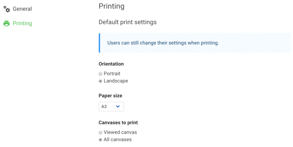
It’s now easier to ensure that your carefully designed dashboards come out perfectly when viewers choose to print them. We’ve added a new group of options for printing to the dashboard settings. These allow you to set the default behaviour for what happens when someone uses the print option (located in the top corner of each dashboards) to create, save or print a PDF version of the dashboard.
Individual users can still select differently, but you can make it more straightforward for them by choosing the orientation and paper size of the PDF output. You can also set a default behaviour for which dashboard canvases are included in the PDF.
General improvements and bug fixes
- We’re continuing to make the dashboard builder’s user interface as easy to use as possible, and this version includes more design improvements.
- We fixed an issue which affected the opacity of series markers for time series charts and categorical charts.
- Related, we also resolved a bug that stopped scatter points from showing on time series charts and categorical charts when the series marker points were turned off.
- When you change the data source for an XY scatter chart, the record card fields will reset correctly, allowing you to customise the record card using the fields from your new data source.
- We fixed a problem with the select box widget which caused it to sometimes display results for each character of a selection rather than the entire selection (for example, a player’s name) as a single tag.
- When you use your browser to enlarge or shrink a dashboard, the canvas width (including tabs) should now behave consistently.
Feel free to contact your lead sport scientist if you have any questions about building dashboards, or you can visit the dashboard builder guide.
Highlights from your last dashboard builder newsletter
In your last newsletter we announced:
- The exciting new widget for creating matrices.
- The use of initials for avatars with no profile picture.
If you missed it, you can read the last dashboard builder update here.