Smartabase’s dashboard builder has fantastic new features that we’re excited to share with you.
If you haven’t tried the dashboard builder yet, check out our helpful guide. We’ll show you how to set up dashboards, use dashboard components and understand the data being displayed within your dashboards.
Enjoy version 2.24 of the dashboard builder!
Zoom and sub-chart functionality for the time series and categorical chart widgets
You’re now able to make use of new zooming and sub-charting behaviours that we’ve made available for the time series and categorical chart widgets. The zoom function lets you take a closer (or broader) look at chart data using the scroll or pinch ability of your mouse, trackpad or touch screen. When sub-charting is enabled as well, you’ll be able to easily identify how the detail you’re looking at fits into the bigger picture.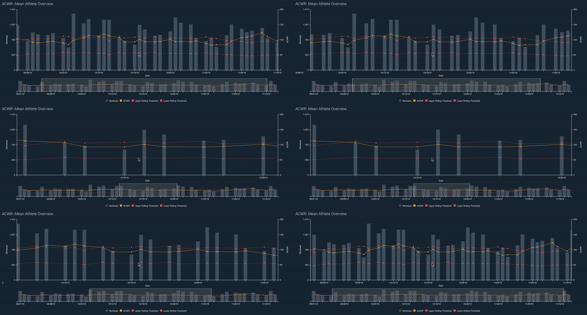
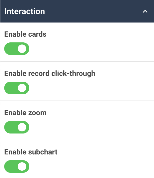
To give this feature a go, use the dashboard builder to open the interaction properties of a time series or categorical chart widget, then enable the zoom and sub-chart abilities.
More customisation capacity for the time series, categorical and XY scatter chart widgets
You can further customise the time series, categorical and XY scatter chart widgets with new options for axis colours, font sizes and padding.
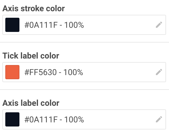
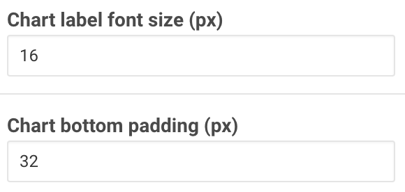
- Axis colours: we’ve added options for you to choose colours for axis strokes, axis labels and tick labels. You can customise these individually for each axis on a chart using the axis properties.
- Font sizes: you can set the chart label font size from the advanced properties to control all axis labels, tick labels, gridline labels, and data labels. Tooltips are not affected by this setting.
- Padding: you can specify the space between the x-axis and the elements below it from the widget’s advanced properties. This is particularly useful for charts with large font sizes to ensure that the axis labels don’t overlap the legend.
General improvements and bug fixes
- You’ll now see ‘natural’ sorting for string (text) data. This means that, for example, instead of select box widget values being ordered as Round 1, Round 10, Round 11, Round 12, Round 2 and Round 3, you’ll see those values sorted as Round 1, Round 2, Round 3 through to Round 10, Round 11, Round 12 and so on.
- When you’re building a dashboard you can choose to collapse the left sidebar.
- If you have string (text) data set to display in the matrix widget, any line breaks in the text are respected.
- We’ve redesigned the pagination controls for table widgets. This also resolves an issue on narrow screens where the pagination controls would flow off the screen. Additionally, the pagination controls now display the total number of pages.
- We fixed some issues that prevented the dashboard status from updating to reflect your unsaved changes when editing a dashboard.
- We updated the behaviour of avatars to ensure that names containing special characters display correctly.
- We resolved an issue that permitted parts of a dashboard to obscure the drop-down list when you’re using the select box widget.
Feel free to contact your lead sport scientist if you have any questions about building dashboards, or you can visit the dashboard builder guide for more information.
Highlights from your last dashboard builder newsletter
In your last newsletter we announced:
- A new widget for creating pie and donut charts.
- Improvements to the print settings for dashboards.
If you missed them, you can read the last dashboard builder release notes.