We’re proud to bring you version 2.27 of Smartabase’s dashboard builder.
If you haven’t tried the dashboard builder yet, check out our helpful guide. We’ll show you how to set up dashboards, use dashboard components and understand the data being displayed within your dashboards.
Enjoy using version 2.27 of the dashboard builder!
Create more accessible data visualisations with the legibility property for conditional formatting
It can sometimes be difficult for people to distinguish and understand information if its colour doesn’t contrast sufficiently with surrounding colours. For example, when you have dark grey text on a black background or pale yellow text on a white background. Depending on how you choose text and icon colours, background colours and ruleset colours for components of your dashboards, you can accidentally create a data visualisation which is hard for people to interpret.
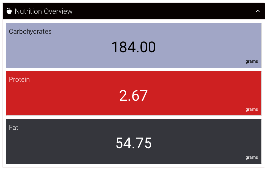
For this reason, all widgets which can use rulesets now have a new property to enhance the legibility of information in response to changing background colours. This means that you can set font (and icon) colours and then enable conditional formatting without negatively affecting readability.

In our example, all tiles use the same text colour setting and conditional formatting with the legibility feature enabled, which adjusts the text colour to black or white depending on the background colour.
You can use the legibility feature to improve the accessibility of tiles, table columns, matrix values, matrix summary columns, matrix summary rows, and aggregation table columns.
General improvements and bug fixes
- While not visible to you, this version of the dashboard builder also includes enhancements for security and stability.
- We’ve redesigned the print settings screen shown when people use the option to print a dashboard. It’s now a little more streamlined and simpler to use.
- You’ll now see a new error message if there’s a problem with how one of your widgets is set up.
- We solved a problem that sometimes stopped record cards from displaying when data points on a time series chart were selected.
Bug fixes that were released between 2.26 and 2.27
- We fixed an issue where time series charts would not obey bar width ratio settings.
- Resolved an issue where time series charts would sometimes display incorrectly when you used the print option.
- Y2-axis minimum and maximum settings should now behave correctly.
- Regions now display correctly on charts with rotated axes.
- Regions for time series charts will resize themselves when you resize your browser window.
- Similarly, we’ve resolved an issue where time series chart regions would not reposition to match the axis when data changed.
Highlights from your last dashboard builder release notes
In the last release notes we announced:
- New features for the aggregation table widget.
If you missed them, you can read the last dashboard builder release notes.