Version 2.43 of the dashboard builder has been released. As a part of this release you’ll find the added capability to display custom dates or times across a time series charts, as well as a new feature to work with nested CSV data stored in your data sources.
If you haven’t tried the dashboard builder yet, check out our helpful guide. We’ll show you how to set up dashboards, use dashboard components and understand the data being displayed within your dashboards.
Choose custom date or time field on time series charts
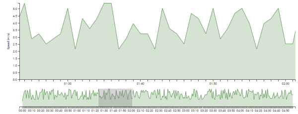
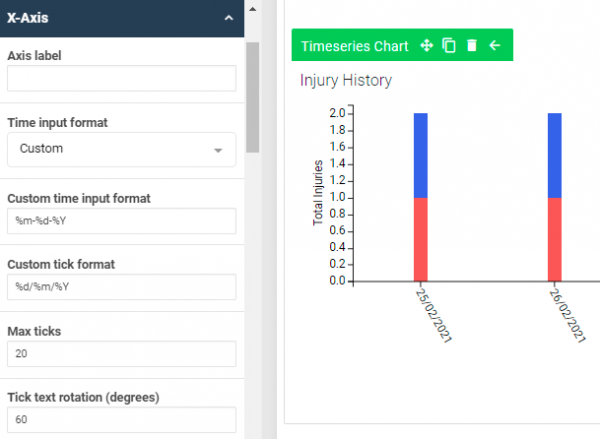
In previous versions of the dashboard builder, time series charts could only break information down by the event date of a record. This release includes the ability to choose a different date or time field from your event form to display across the x-axis of your chart. You can also adjust the format that the date or time is displayed in using standard time format directives.
Visualise nested CSV data in dashboards
Note: using this feature without consideration of the volume of data can impact a dashboard’s performance. It’s highly recommended that you speak to your Smartabase representative before implementing a workflow using nested CSV data.

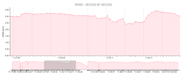
Some event forms are used to store CSV data related to metrics over a period of time, such as speed or heart rate over a training session. We’ve added a feature to the data source configuration page where you can identify a field containing nested CSV data and specify the column headers (i.e. metrics) included.
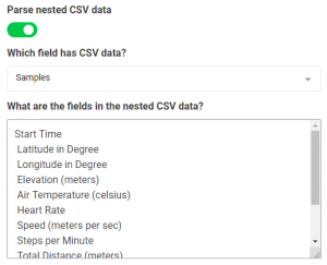
Thanks to this feature, you’ll be able to use existing dashboard widgets to visualise and aggregate nested CSV data. For example, you could set up a tile widget to display the average heart rate over a training session, or plot speed over the whole session on a time series chart.
General improvements and bug fixes
- We’ve resolved an issue in the builder interface where the clear button wasn’t working correctly when setting up instructional content in dashboard widgets, sections and canvases.
Highlights from your last dashboard builder release notes
In the last release notes, for version 2.42 of the dashboard builder, we announced the following changes:
- We added improvements to how sample data is displayed when building dashboards.
- We improved how dashboards display on larger screens.
If you missed those release notes, you can read them here.