We’re pleased to give you a brief update on Smartabase’s dashboard builder.
If you haven’t tried the dashboard builder yet, check out our helpful guide. We’ll show you how to set up dashboards, use dashboard components and understand the data being displayed within your dashboards.
Record cards and click-through for tiles, time series charts and categorical charts
In the last version of the dashboard builder, we released the record card function and click-through ability for tables and XY scatter charts. In this release, you’ll be able to use this functionality with more widgets – the tile, time series chart and categorical chart.
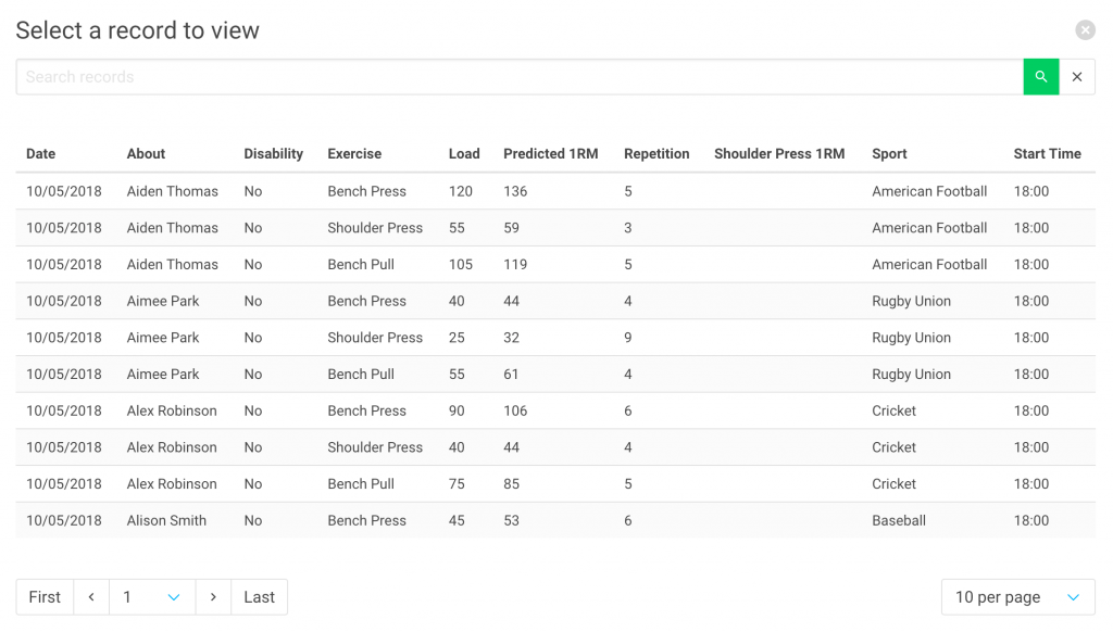
Because these widget types can use aggregated data, we’ve built in a record selection process that lets you choose which record to view a card for. You can easily search the record list from the selection page, then pick a record to view in more detail. If click-through is enabled, you’ll be able to then go to the source record.
Read more about setting up interactions in the dashboard builder help documentation.
More flexibility when aggregating data

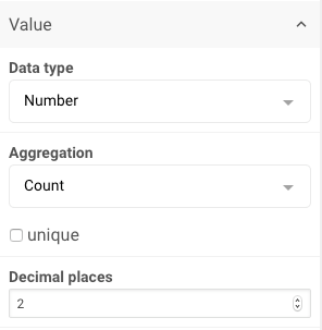
When aggregating using count, nth maximum, and nth minimum, it is now possible to apply the aggregation to unique values only. Using the unique function is a way of ensuring that repeated values are ignored and only unique values are aggregated.
This means that, for example, if you want a tile to display the third highest running distance (m) for a day and the data included the values 1000, 2000, 2000, 3000, 3000 and 4000, you could use the unique function with the nth maximum aggregation to get the tile to display the correct value of 2000.
You can learn more about how aggregations work here.
General improvements and bug fixes
- We’ve provided clearer guidance about the characters you should use when naming your dashboards
- Stacked bar charts have now been fixed to prevent them displaying incorrectly on the time series and categorical charts in instances where some data points don’t have data.
- When readers choose to hide a time series or categorical chart series by selecting it using the legend, those series now stay hidden when data in the chart is updated (for example, when changing sorting on a categorical chart).
- The list of items available to add to a record card now correctly displays items that have been de-selected.
- We’ve fixed an issue that prevented record card items for table widgets from resetting when the data source is changed.
- Data sources which were linked to select box or date picker widgets can be deleted.
- Section borders and background colours now obey transparency settings.
You can contact your lead builder if you have any questions about building dashboards or visit the dashboard builder guide.
